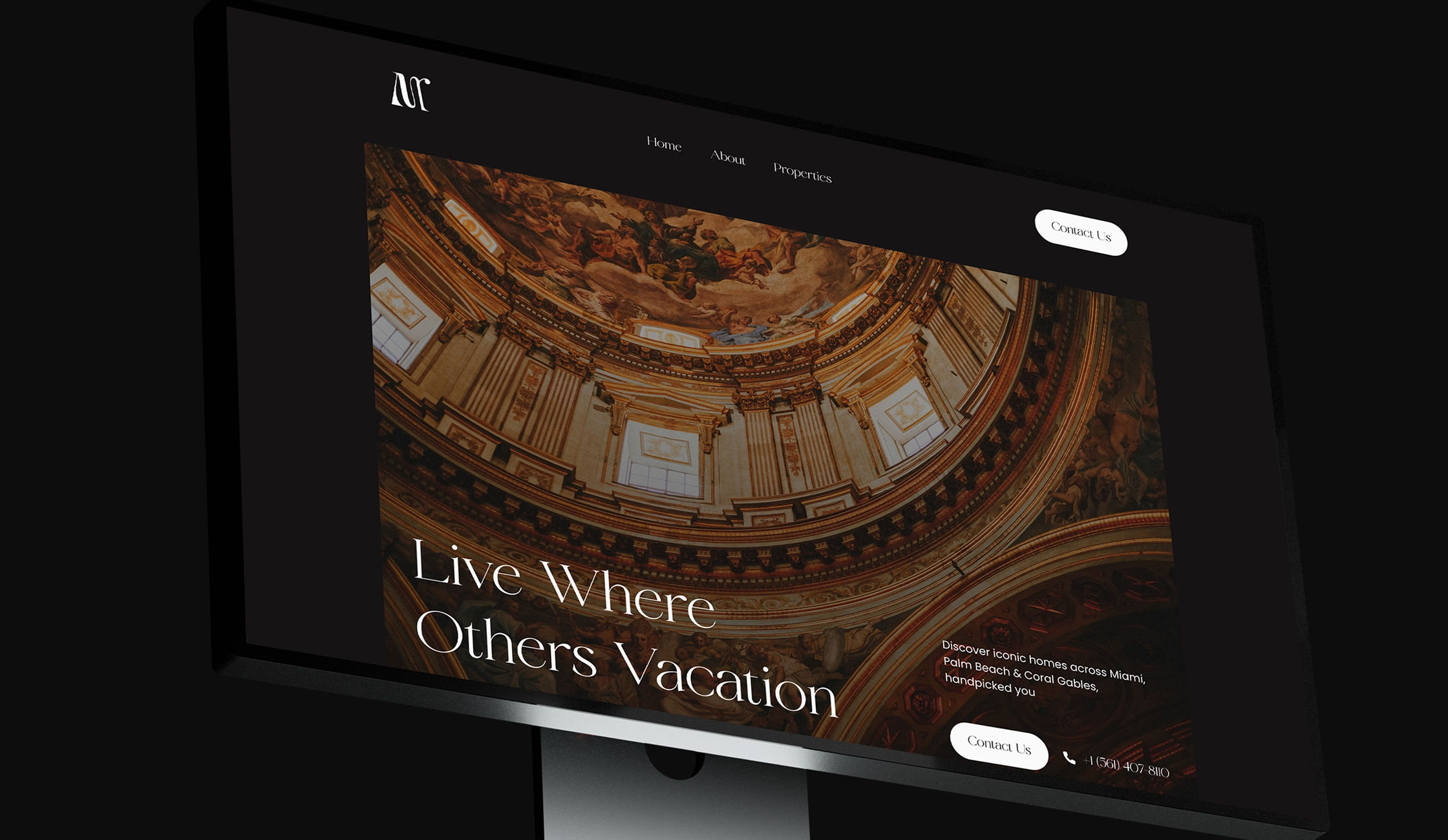
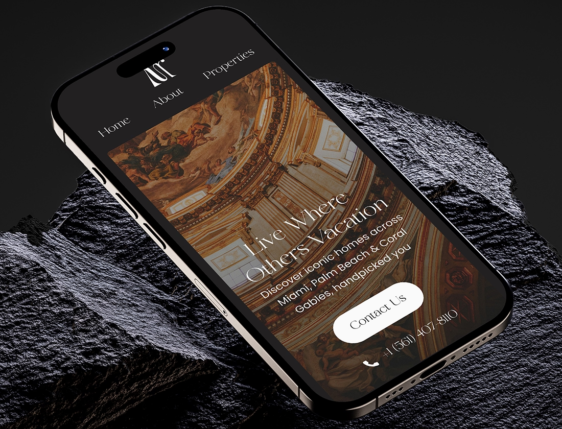
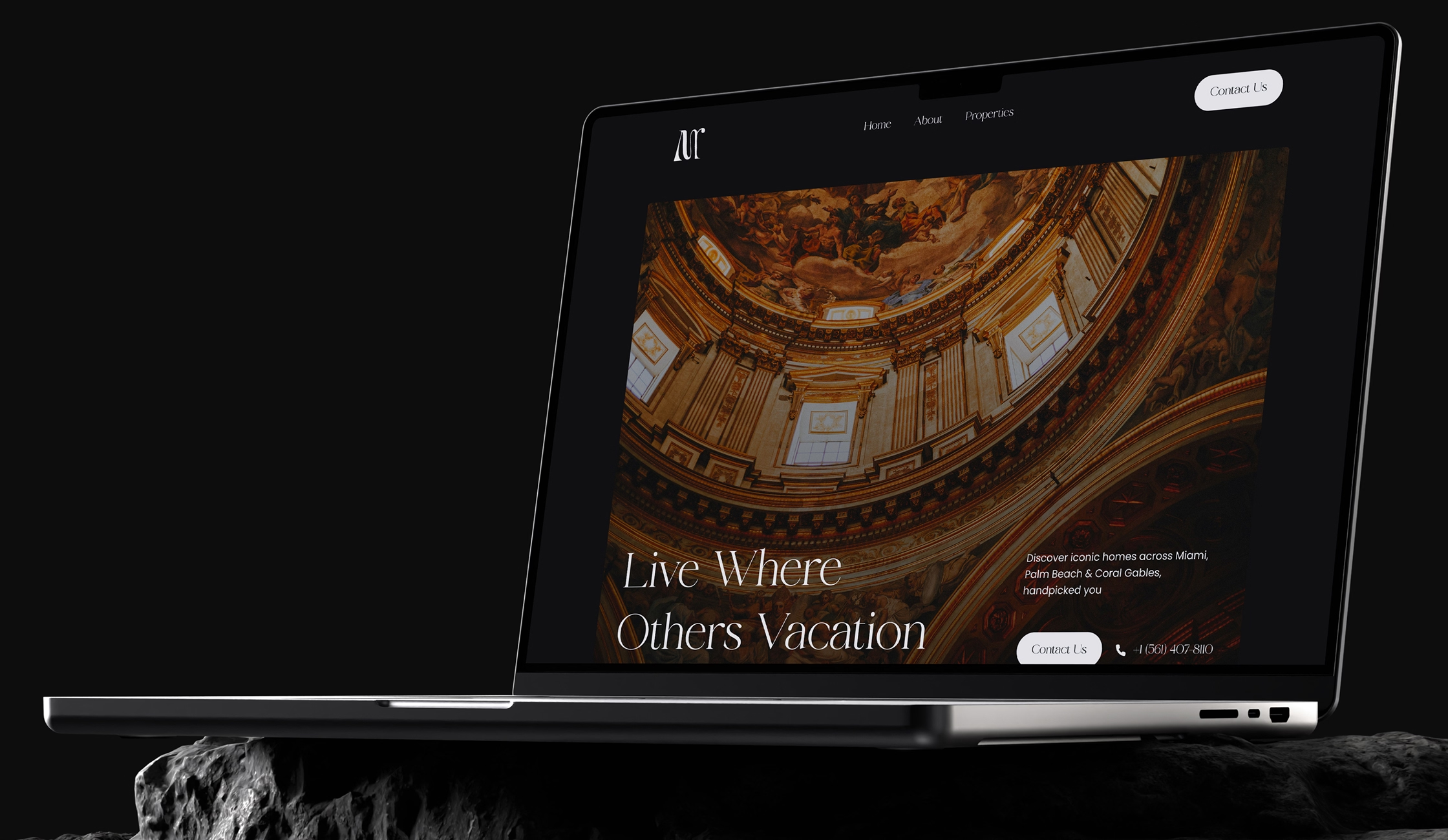
This phase focused on translating the agency’s market position into a cohesive brand system.
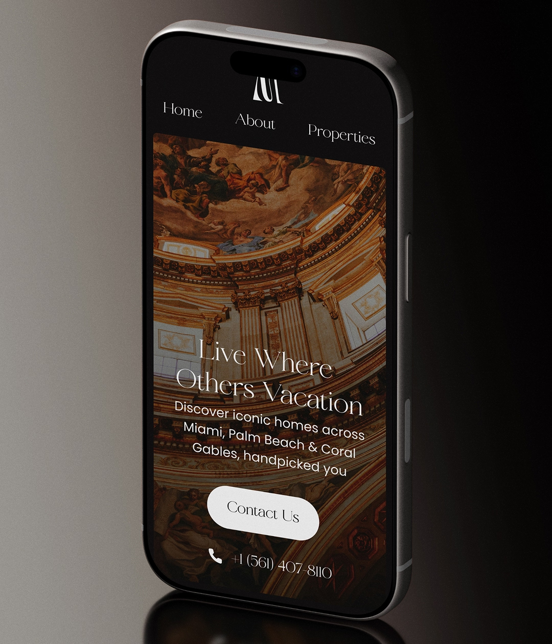
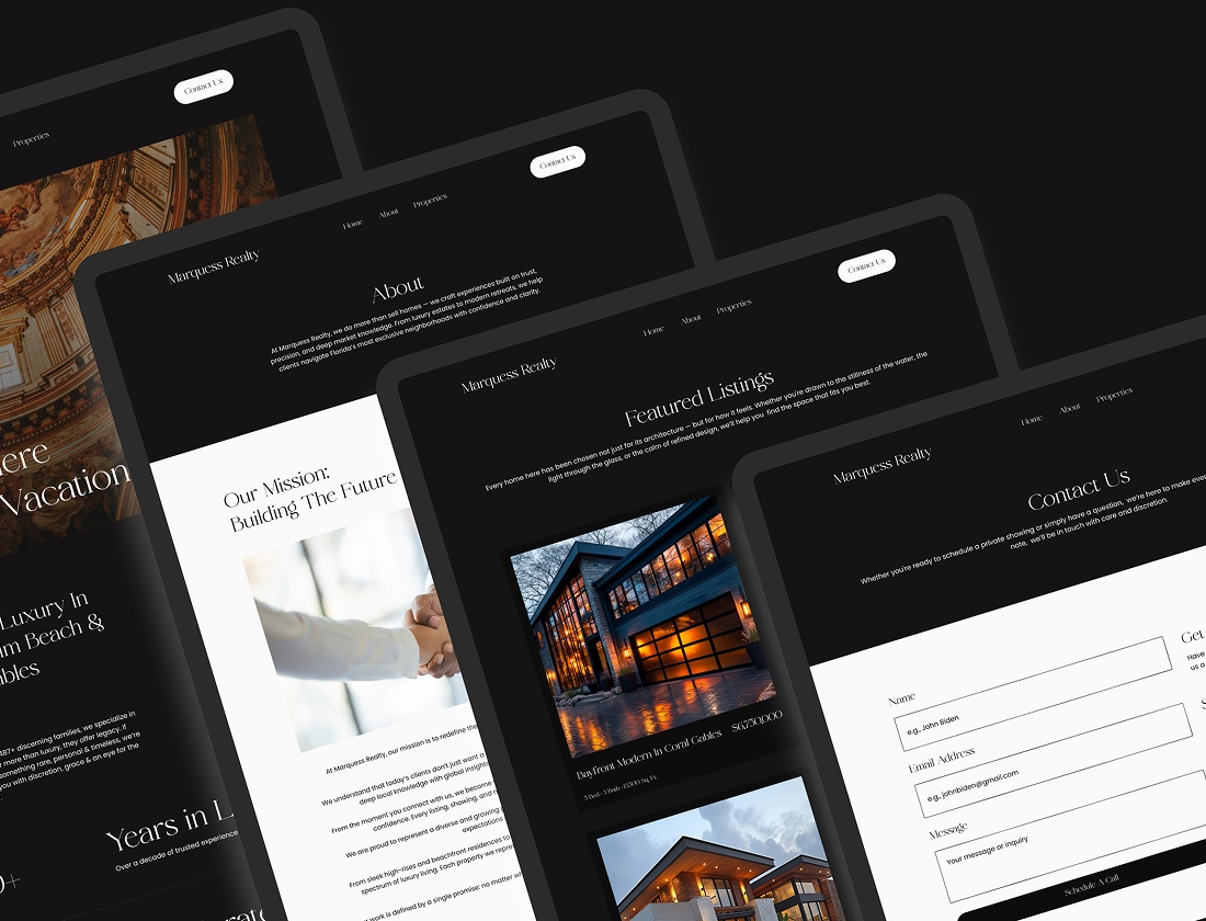
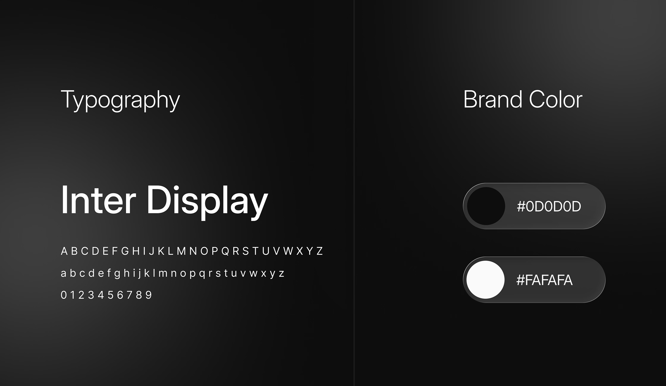
The strategy emphasized consistency, clarity, and control. Visual elements were designed to feel solid and dependable, mirroring the agency’s role as a trusted intermediary in high value transactions.
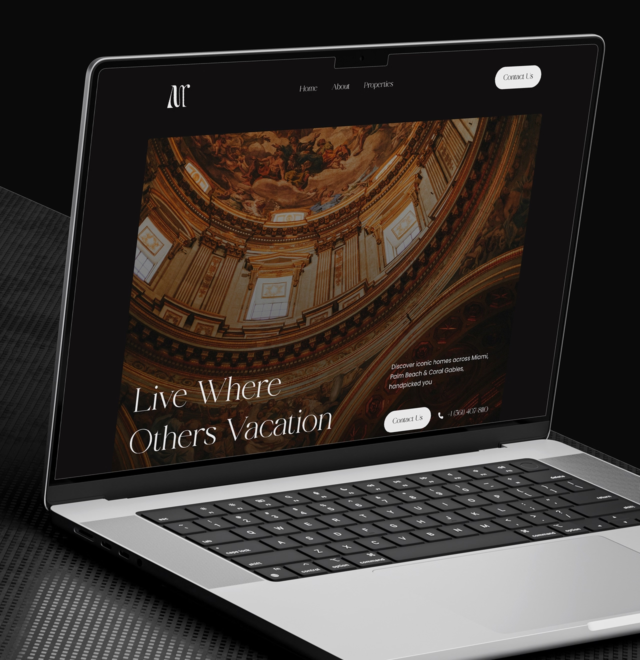
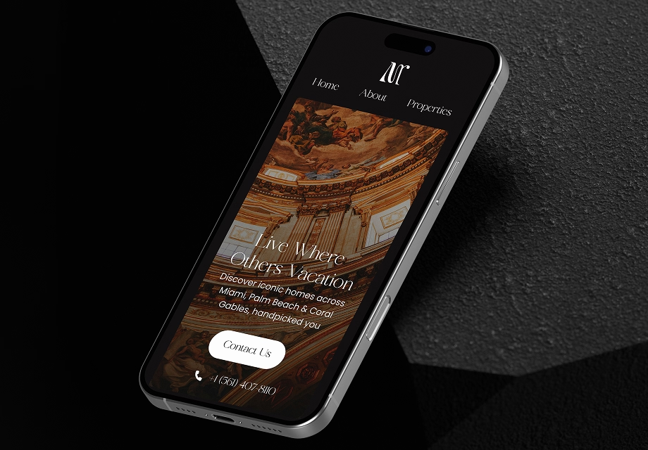
Typography, spacing, and layout rhythm were carefully balanced to support both brand storytelling and property presentation. The design avoids clutter, allowing listings to breathe while keeping the agency identity present throughout the experience.
Content hierarchy ensures visitors can quickly understand who the agency serves, what markets it operates in, and why it can be trusted with important decisions.
This strategic foundation allows the brand to scale without losing focus or identity.