This phase focused on translating financial expertise into a composed and reassuring brand experience.
The strategy emphasized balance — authority without intimidation and clarity without oversimplification. Every section was designed to help clients feel informed, supported, and in control of their decisions.
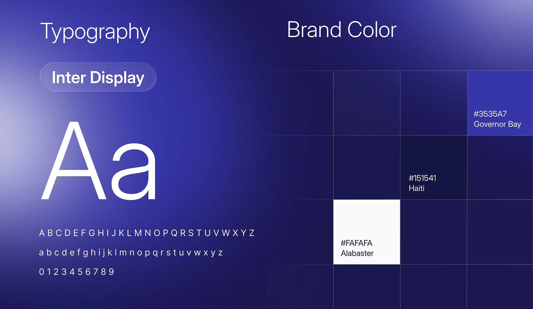
Visually, the design relies on structured layouts, generous spacing, and restrained color usage. Typography plays a central role in guiding attention and reinforcing credibility without relying on visual noise.
The result is a finance advisor brand that feels thoughtful, dependable, and built for long-term trust.